
The Definitive Guide for Building a Sign Page for PLG
This guest post is by Madhukar Kumar, CMO SingleStore and ex-DevRev.
… if they take the first step towards trying out your app. Make the door formidable with entry barriers, and you turn away potential customers. Make it too easy to enter, and you may end up with several curious visitors who may not be the right users for your product. Instead, build it right by adding just the right amount of gradation of experience that you continuously test, and you now have a PLG journey that adds boosters to your growth.
In this chapter, let's look at the different kinds of sign-up pages, with the pros and cons of each type, how to build the right instrumentation and dashboard to measure conversion on the page and efficiency of your campaigns, and finally, some resources you can use to get started if you are starting from scratch.
Broadly, I see three kinds of sign-up pages -
- All in one page.
- A progressive discovery page that starts with a landing page and evolves as the users progress in their journeys.
- A minimalistic login plus sign-up page.
1. All-in-one sign-up page
The all-in-one page typically has information about your app, value propositions, some social proof, and finally, a form with a few fields that users must fill out to sign up for a free trial. Some companies choose to have screenshots of the app or a video to let people know what to expect from the app if they sign up.
These kind of pages typically work well with B2B companies and help users reaffirm what they may already know about the company and the product.
💡 Having a video on these pages is a good idea but make sure they are captioned and not more than 100 seconds to try and not overwhelm the visitors.
Some examples of these kinds of pages include SingleStore.com or Salesforce.com.

Since you are only dealing with one page, a significant advantage of having an all-in-one page is easy maintainability, measurement, and experimentation. You can continuously look at the page's performance and continue to tweak the content or the image to see what works and what doesn't with an extremely sharp focus. From the users' perspective, they get all the information on one page, and they can make a decision right there if they want to proceed further on not.
One of the biggest mistakes you can make with an all-in-one page is not having a social sign-in button (for example, Sign up with Google or LinkedIn) and a form with more than three form fields.
💡 In one of my previous experiences, when we replaced the form with just one field (email address), the conversion rate on the page went from about 1% to 36% overnight.
In B2B companies, there is often a struggle between getting information from the signed up users so that the BDR or SDR teams can contact them and request meetings vs. having just one field to sign up, which leads to significantly higher conversions but not enough information for the sales teams to action on.
Fortunately, there is a happy middle ground between asking for too much information and risking bounce vs. asking too little and adding noisy data and often costs to your PLG initiatives. That middle ground is making a call to a service like Clearbit that can enrich data with an async API call and pre-populate or not ask questions that may already be known, for example, company, title, etc.
However, this strategy of not asking what you may already know about your users also works well with the second kind of Sign Up page - the Progressive discovery page.
2. Progressive discovery pages
In a progressive discovery page, you may have all the information about the application or what to expect when you sign up on a product page or a landing page. Once you click sign up, you are asked a question about your name or just an email to get started. Once you answer the question, you are then taken to a new page that asks for the following information and the next till you are finally in the application.
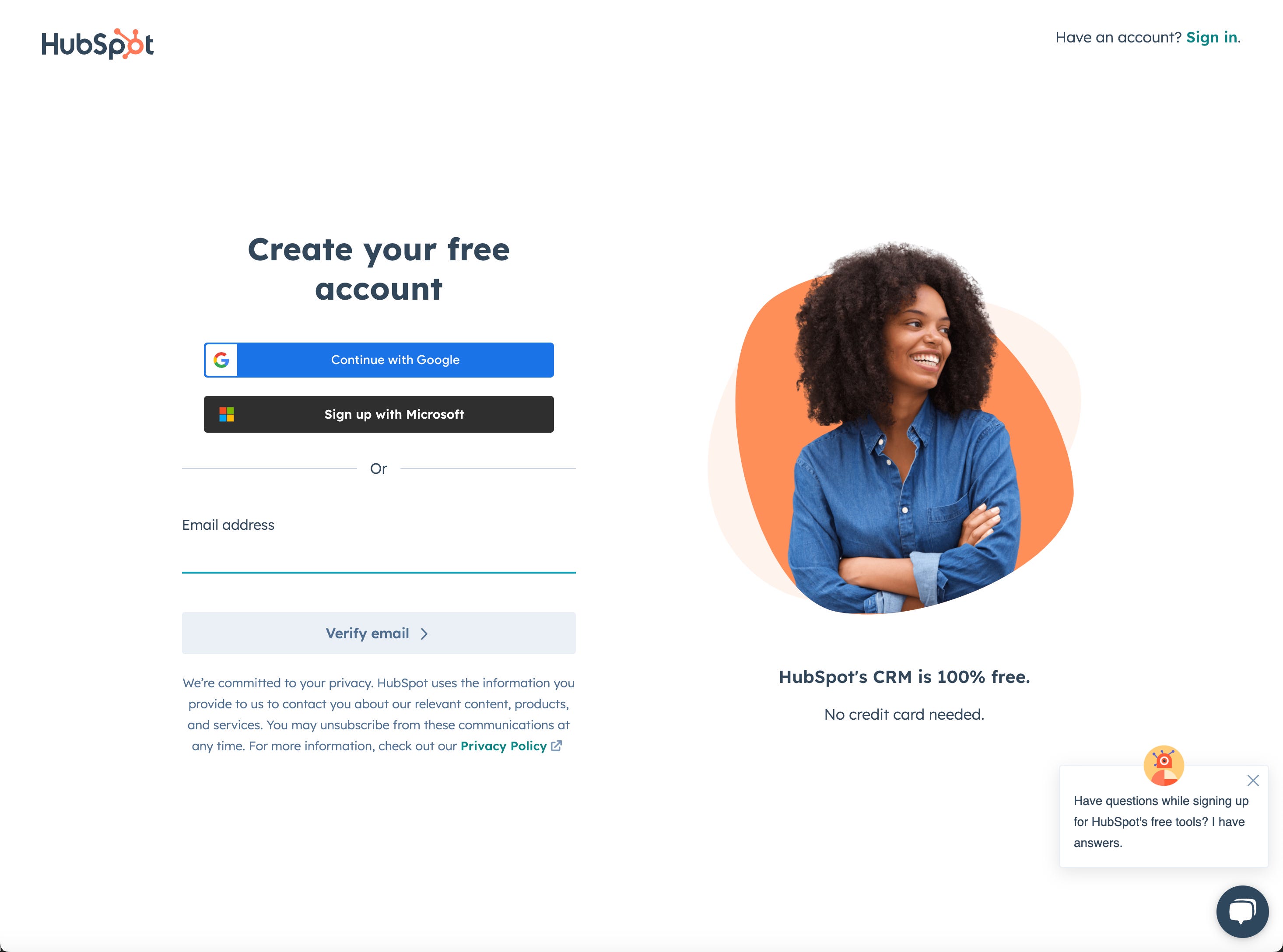
Hubspot.com is an excellent example of this user journey and typically works if you may need to learn a lot about the company or the product. Each page gives you a little more information. Since you are already vested by having provided some information, you are more and more likely to fill out the other information rather than abandon.
💡 In progressive discovery pages, it is always a good idea to give a visual cue of where the user is in the overall sign-up process, for example showing 1 of step 4 completed. Your users are more likely to abandon sign-up if they don't have visibility or control of the overall sign-up experience.
This kind of sign-up experience is also very common in the credit and insurance businesses, and this does have the downside of lowering the credibility of your brand if you end up asking way too many questions (more than four, in my opinion) or not providing access to the app or product at the end of the sign-up experience. Imagine if you had to go through a ten-step sign-up process, and in the end, you get a screen that says - "Someone will be in touch with you shortly."
Another disadvantage for these kind of pages is maintaining several pages and aggregating the analytics across all the pages to view where the most abandonment happens.
3. Minimalistic Sign Up and login page
This has become increasingly common over the last few years. Some well-known brands like Notion.com and Typeform have minimalistic Sign-Up and Sign In pages.

In these kinds of pages, you only have a login screen with social login methods (for example, Sign Up with Google or LinkedIn), and users have to provide only their email and their name or choose the social login button to sign up. These pages are great for user experience and typically have a higher conversion rate. Still, you run the risk of having many people sign up with disposable email addresses, compromising your data cleanliness and, eventually, the conversion rate from free trial to paid. This may be ok for companies that are more geared towards B2C spaces that are aiming at a broader and generalized user base where the cost of a trial is near zero (in terms of operations). Even if the users don't become paid customers, the free trial serves as a great brand awareness initiative for the company.
In a B2B company, these pages should always be complemented with a powerful home page that provides all the information a user may need before signing up and should be linked from the sign-up/login page. However, one of the big risks for this kind of sign-up page is that the login and the sign-up page are not easily discoverable from an SEO perspective, given that there is no content on sign up the page itself. Therefore, for companies that invest in this strategy, there should be a solid SEO strategy with several key SEO pages and blogs linked to this page.
There is a fourth kind of page called the hybrid page (for example, Datadog) that shows you a minimalistic sign-up page, and if you click on sign up, it goes into a progressive sign-up page.
Ultimately, how you want to set up your page depends on the answers to the questions below for your business.
- Are you looking to provide a limited-time full functionality trial, a free for-life with limited functionality trial, or a consumption-based trial where you get users to start their trial with free credits?
- Is the cost of trials or free tier negligible or next to zero for your business?
- Is your brand well-known, or do you also want to generate brand awareness with your PLG?
- Are you a B2B company looking to bring in sales at some point in your user journey?
Now that we have looked at the different kinds of sign up pages, let’s now look at the second most important piece of the PLG sign-up page puzzle - the data architecture.
Broadly, two methods exist to capture user information from a sign-up process. There are others, but the categories below ultimately represent who owns and maintains the sign-up page - the marketing or product teams.
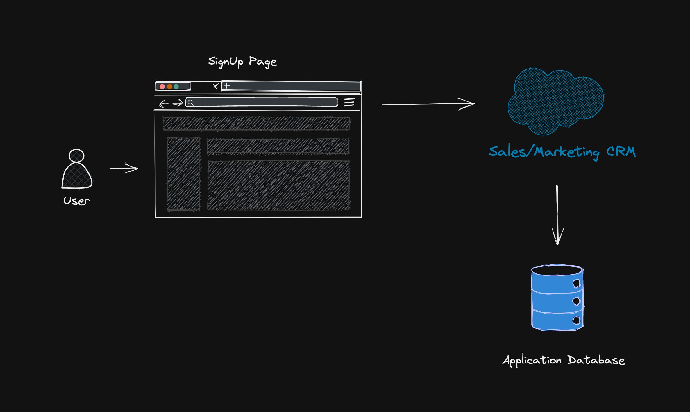
- Marketing owned - In this method, the form is connected to a CRM, so whenever someone signs up, the user is created in the CRM first. Then the sign-up in the app happens through a unique verification URL sent over to the user through email to verify the email address. This method does help from dissuading users from creating fake accounts or using someone else's email address to sign up. However, there is a drop-off in people who fill out the form and those who log into the app because the user is in the sign-up process in the browser (frequently on a mobile device). Now the experience is re-routed to an email app which may or may not be accessible to all the users while they sign up. This kind of sign-up experience may also lead to incorrect sign-up information since you may end up reporting how many people signed up for the experience but not necessarily how many verified their email and signed in for the first time, which is being collected in your app database.
- Even though in this method, the marketing team may have complete control over the experience (typically works well with all-in-one kinds of pages), you should strongly consider the second method where the product team owns the sign-up page. If you follow the steps in Chapter 2, the marketing team can still have complete parallel control of copy and design through a separation of code and content architecture.
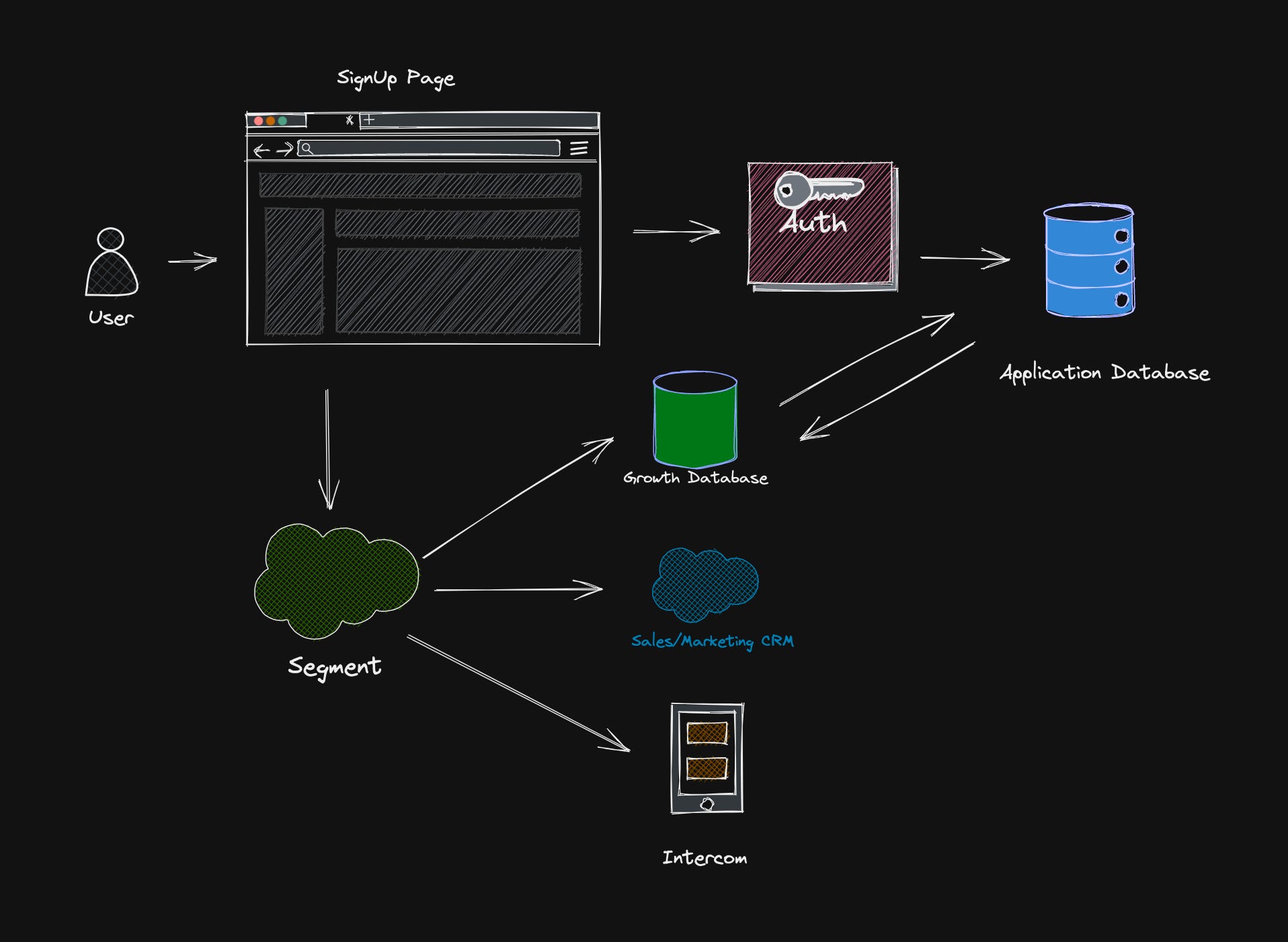
- Product owned - In the second method, the form is connected to the app database through an authentication intermediary like Auth0. Here, all verification happens through the tool, and once the user is authenticated, the data then makes it over to the app users table in the database. Then that data is dropped into the marketing CRM through an async process or a batch job. The advantage of this kind of sign-up is that you have a single and solid source of truth of verified users who signed up for the app but if you are a marketer you may not have a real-time look into how many people are signing up for a specific campaign or event you may be running and may be interested looking and actioning on.
- In order to get a real-time view into your user process you can do one or both of the following things a) Use a tool like Intercom that gives you a live view of your user signs up and offers an excellent way to communicate with users while they are logged in or 2) Use a CDP like Twillio Segment that collects the first party data and then deposits that data synchronously in multiple destinations including but not limited to your CRM. I recommend depositing the data directly into a growth analytics database like SingleStore so that you can run your own queries and collect insights in real time. This brings me to the last section of this chapter on instrumentation and dashboard.
💡 Should you ask for a phone number during sign-up?
It depends on whether you want to have fewer and more qualified sets of user sign-ups to engage through sales or if you want to have a more B2C kind of goal where the idea is to bring in as many users in the funnel as possible with the opportunity of engaging with your free users through in-app and email channels.
How to set up the page with the right instrumentation and reporting from the get-go.
When you set up your page, consider using a universal tag manager like Google Tag Manager so that you are not adding multiple javascript includes with niche use cases that tend to bring down the page performance over time. In addition to Google Tag Manager, I recommend adding something like Segment directly into your pages so that you can define and measure other custom events specific to your website and app and run analytics over it directly through a database.
- Web analytics - Typically, most companies use Google Analytics. It is free but not a very user-friendly tool and has a 24-hour time lag for data collection and reporting. I have been recently intrigued by Fathom analytics which costs money, but it has a much better user interface to look at the anonymous traffic on your website and sign-up page.
- Heatmaps - You can use tools like Hotjar or Fullstory, but in my experience, I have found these overwhelming if you are looking only to figure out where the drop-off is. A better way to do this is with an A/B testing tool like Launch Darkly or Optimizely.
- User journey - Several tools like Heap, Amplitude, and Mixpanel look at how the users came to your sign-up page and what they did after. Mixpanel is very useful for seeing where the drop-offs are. Nevertheless, I suggest piping all data into a database like SingleStore and then using a tool like Metabase or Tableau to view your insights and run your queries.
- Full dashboards - New emerging companies like Houseware and Hockeystack give you no-code solutions to end-to-end customer journeys, and you may consider them in terms of what you are looking to do. These tools are great when starting anew, and you don't have to worry about data migration.
💡 What is a UTM, and how to use them for measuring your campaign?
A UTM is a URL typically consisting of three variables - Source, Medium, and Campaigns. Using these three variables, you can create different campaigns, landing pages, and URLs to share over QR codes or emails and then see how many users came into your sign-up page through a specific campaign vs. source or medium. Here is an example of how I may use a UTM. Let's say I am running a webinar encouraging users to sign up for our app. I want to see how much money we spent on each webinar and the number of sign-ups. So for my specific webinar, I can create a URL like this -
https://mysignuppage.com/signupsource=webinar&medium=email&campaign=mywebinaronchatgpt. Once someone clicks this URL, the variables are recorded in Google Analytics and your database so that you can see how many users signed up for the campaign - mywebinaronchatgpt. This way, if you spent, say, $1,000 on this webinar and got 100 sign-ups, you now know that the cost of a sign-up for this webinar was $10, so you can decide about future webinars.
Conclusion
When building a Sign Up page, first figure out what kind of page works best for your business depending on whether your brand is well know (use minmalistic), B2B (all-in-one works great) or B2C and who owns the code and content for these pages. In addition, make sure you set up the right instrumentation so that you are measuring in real-time how many and what kinds of users are coming in to your app and finally, figure out a score of separating High Value Users (HVUs) from the rest and coming up with a personalized onboarding plan.


